Perpetually Falling Horse

Or, Lost in the Jungle.

This morning I spent some time on the Digital Comics Museum looking at comic books from the 1930s and 1940s that are now in the public domain in advance of thinking through some of our coding protocols. Looking specifically at Jungle Comics 38 (Fiction House, 1943) I came across this page that initially flummoxed me. Here's the page:

You can imagine the story: the man is Kaanga, the blond king of the jungle, and here he is rescuing a woman named Julie who has foolishly tried to ride across a river just upstream from a waterfall.

What is unusual here is the second panel, which stretches across two tiers. Double-height panels are not at all uncommon in comic books of this period, but they seem less likely to appear in the middle of three columns than either side (something, I suppose that we'll have to verify empirically). Anyway, my initial presumption was that the page read in this direction:

Confronted with the tall panel in the middle, I assumed that the first move was to go down, then across. Yet if you read the captions, it is clear that this is not the case at all. The reading order is actually like this:

This reading pattern was surprising to me because of the long diagonal move back to the beginning of the second tier that moves through panel two again. Further, it is clear that the reader seems meant to skip the waterfall panel on the second left-to-right read through, otherwise that horse is simply hanging in midair forever. I suppose that might be one explanation for why Kaanga and Julie don't land on the dead horse at the bottom...

I'm not sure, precisely, how we would be meant to read this in terms of the typology that Scott McCloud provides in Understanding Comics. If we are not intended to re-read the waterfall, then the panel itself becomes a sort of over-sized gutter in an action-to-action transition. But that seems completely erroneous. Indeed, it seems that we are meant to go through the waterfall a second time - though maybe without the horse falling on us. 

It's a dangerous business.

Excluding Comics

Given that the central drive of our research project is to define what was “typical” of American comic books over the past eight decades, we need to begin with a working definition of what is an “American comic book”. We have already signalled that problem with a discussion of the Spirit supplements that began in the 1940s, but there are plenty of other occasions where this issue raises its definitionally ugly head.

In order to define typicality, it is our goal to randomly sample two per cent of the comic books published in the United States. We are not interested in “the best” works but wish to work from a completely neutral sample set. This requires several steps:

1. Define what we mean by a “comic book"
2. Determine how many “comic books” were published in each year
3. Randomly select two per cent of those to form a data set
4. Track down electronic or physical copies that are in the data set

One interesting thing that I’ve already discovered is that it is somewhat easier to do step two than it is to do step one.

Right now, we are extremely fortunate that a tool like the Grand Comics Database exists. This volunteer project has been cataloguing comics in the United States and around the world for a long time, and it is a remarkably flexible and searchable database. Over the past few days I have been running some experiments using the GCD data using their Advanced Search functionality where I can set country of publication to the United States and delimit an annual date range very easily. Let’s consider an example:

Setting the date range to 1970 returns 1,635 items. Even right there on the first page of results, however, we run into a couple of issues. Scrolling down we see Archie and the Generation Gap and Archie’s Girls, both published by Bantam Books. Since I have own both of these as a result of writing Twelve-Cent Archie, I can tell you that these are not “comic books” in the sense that we are using that term - they are books that we would like to exclude.

So how to best do that? The simplest way would be to refine our search based on format, by narrowing it to comics that are “saddle stitched” (to use a GCD term). This reduces our count from 1,635 to 1,432 and it eliminates the Bantam Books. Success! But, what if we have eliminated too much with this search? After all, many giant size comics (like Annuals) were square bound. Indeed, a search with “square bound” as the format turns up 411 comics (certain titles, like Action Comics, are listed with both formats). That’s not ideal. Similarly, searching with “cardstock” as the paper stock catches the Bantam Books and others (44 in total). At first glance, it looks like all of those should probably be excluded.

Beginning with “saddle stitched” isn’t a great deal of help because the GCD likely includes magazines that we might want to exclude. We could refine by searching on “standard silver age size” - this brings up 1,065 results - but that makes me wonder how we could have possibly excluded such an enormous proportion of our initial search (almost 600 issues). The GCD has a more expansive definition of comics than what we are using, which is great, but finding exactly the information that we need becomes a challenge.

There is one obvious solution: Review all the data by hand. Simply begin with the largest number and then check the entries and do the exclusions manually. I did that, for example, for 1935.

Running our basic search for 1935, we get 41 results. This seemed intuitively high to me based on my knowledge of comics history. Indeed, some results seemed to need to be scrubbed right away. The Seventh New Yorker Album, is a hardcover collection of New Yorker gag cartoons and is not what we would conventionally call a comic book. It’s out. The strip collections published by David McKary (Popeye, Henry, Little Annie Rooney) similarly don’t fit our conventional definition - they’re out. The Tijuana Bibles that have been included here should be out. Finally, the first result is eight issues of Ballyhoo, a Dell published humour magazine that was an important forerunner of Mad. It’s a fascinating magazine (read about here), but it doesn’t fit our initial working definition.

In the end we are left with New FunNew Comics, Mickey Mouse Magazine (a semi-borderline case because of the heavier use of non-comics pieces), Famous Funnies, and Big Book of Fun Comics (which has a cardboard cover, but which otherwise seems to fit). That is 24 “comic books” out of an initial sampling of 41. 

In the end, this result doesn’t change much. Two per cent of 41 is less than 1 book and so is two per cent of 24 (we will round up to one for the year). Eliminating titles by hand wasn’t difficult, but the sample size is tiny. By contrast, for 2014, for example, the GCD returns 8,793 results - that will take a lot longer to clean by hand. The very first result shows one of our problems: the first issue of the Image comic book ’68 Homefront is listed three times due to variant covers. That’s a really simple item to scrub out by putting “variant” into the search (an astonishing 1,799 results!). Still, that only brings the initial set to 7,000 entries - an awful lot to cull by hand.

You’ll note that even after all of this work we still won’t have defined “American comic book” format either. Still a lot of work to do before we can even begin!

Bechdel's Tiers

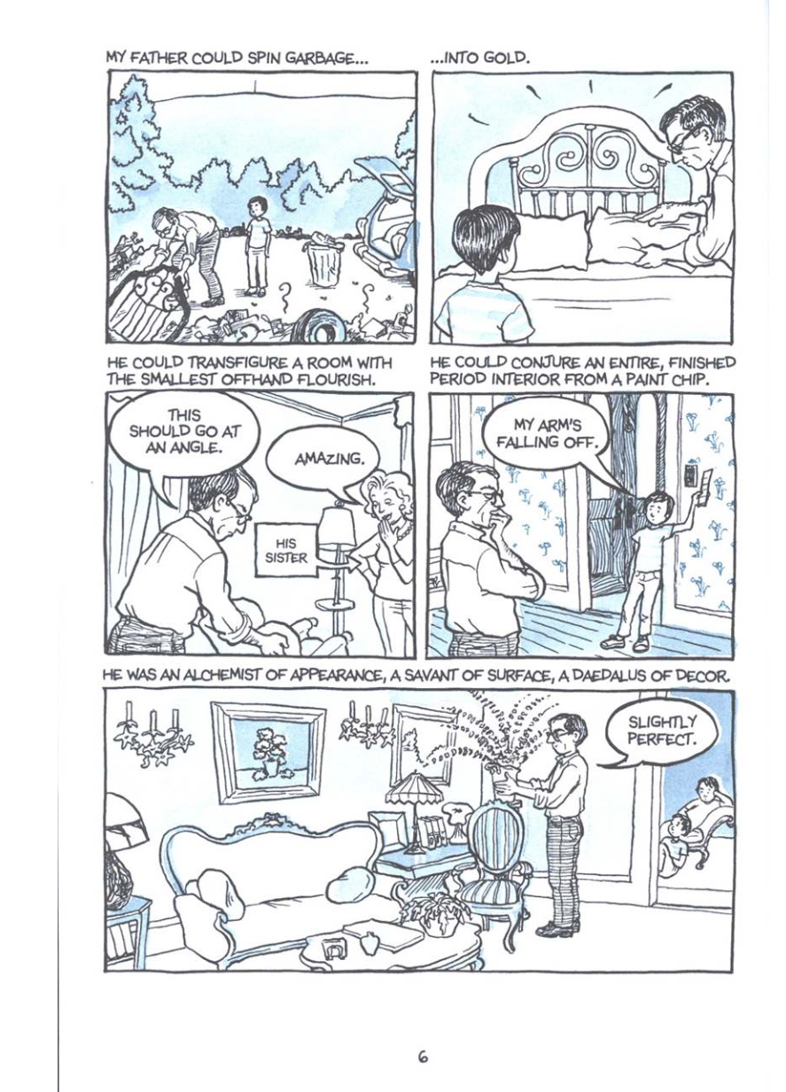
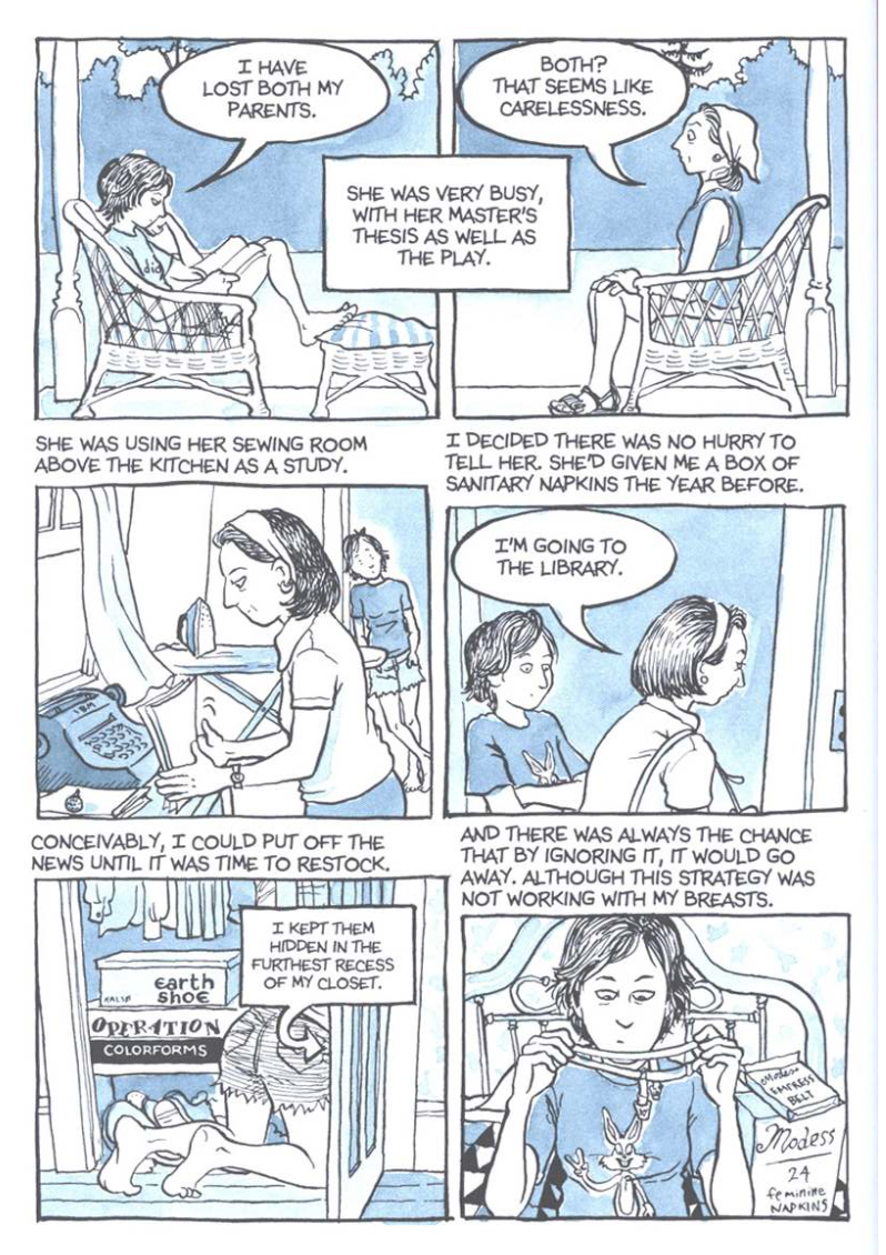
One of the things that I’ve already noticed about this project is how much it has impacted not only the way I’ve been reading comics, but also the way that I’ve been teaching them. This afternoon my undergraduate class wraps up its study of Alison Bechdel’s memoir Fun Home, one of the most remarkable (and most studied!) comics of the past decade.

When we discussed this book in our last meeting, there was a pretty clear consensus in the class that pages 220 and 221 were the “most important” pages in the book. Certainly that is easy to see both narratively (it is Alison’s last important conversation with her father), thematically (it is the scene in which the facts are laid bare), and even formally. What is striking here is the use of the four-tiered grid, the regularity of the panel sizes, and the density of the panels, all of which seem unusual given the previous 219 pages of the book.

Throughout Fun Home, Bechdel uses a small number of single tiered pages (splash pages) as chapter titles:

Most of the book relies on pages with two or three tiers, with the three tier page predominating:

The counting of these tiers will be one of our most important undertakings in this project. In our shorthand while talking about this project we’ve often said we’re counting pages, then panels per page, then balloons per panel, then words per balloon. That’s crude and inaccurate, but it at least gave a general sense of the first stage of our project. Yet even the most cursory glance at a comic book page will demonstrate that before the panel comes the tier - it is central to the geography of the comics page. Moreover, it is not simple. The pages above are all relatively uncontroversial in terms of tier count. But what about this one?

When that first panel stretches over two tiers, do we count this as three? I think that most critics would say that we should, that this page has three tiers but that one panel happens to be in two of them. That’s more of a coding issue than an analytic one. 

But what about this?:

If the previous page was three tiers, this is clearly four. Yet there is something about this page that makes it seem like three - probably the fact that only one of the first two panels has a caption, which makes the lower one seem like it could be part of the upper one. Regardless, I think that this has to be counted as four tiers. That would make this the first four tier page in the book. It also makes the conversation in the car slightly less formally anomalous. Similarly, this page probably needs to be counted as having four tiers:

One of the interesting things about Fun Home is that once Bechdel introduces the four-tiered page, she begins to use it more frequently. I think that an argument could be made about this page being either four or five-tiered:

Nonetheless, it is this conversation between Alison and Bruce that most leaps out at us. Perhaps not because of the number of tiers, but because of the regularity of the panel sizes and the density. There are no other pages that have anywhere near to the number of panels that Bechdel uses here.

After the conversation, which comes extremely late in the book, the four-tiered page becomes a semi-regular feature:

Given the importance of this scene, I think that any analysis that doesn’t take into consideration the increasing importance of the tier as a unit of page design is likely going to be on shaky ground.

Bechdel’s book also poses some interesting conundrums for our coding (if it is randomly selected as part of our sample), but probably not much more than many others. I think that some people presume that the count of panels, for instance, will be relatively straightforward, while the coding of panel transitions (a la Scott McCloud) will be more interpretive. That is certainly true, but panels themselves can cause problems. Bechdel frequently uses panels without images, just text:

To my mind there is no doubt that the panel beginning “It could have been” is, indeed, a panel. Yet what about the other text. What about “He would cultivate”. Bechdel’s captions are overwhelmingly in the gutters in Fun Home (interestingly, this is a technique that she does not much use in her follow-up, Are You My Mother?). They seem intuitively connected to the images below them in a way that “It could have been” does not seem connected to the drawing of Alison watching It’s A Wonderful Life. Yet if the text had appeared above that image, and the image were stretched page-width, we probably would count this as a five panel page rather than a six panel page. There is something about the tier that determines the panel.

Let’s look again:

This seems to be a three-tiered page, with one panel made up entirely of text. Why is it, then, that “Wearing a black velvet dress” seems to not be a panel, while the text beside it does? Is it simply the presence of the panel border?

Finally, there are examples like the first tier here:

That caption spread across the two panels becomes not so much an analytic issue as a coding one (it is akin to a voice-over in film that stretches over multiple shots). This is a common comics technique (though not common in Fun Home). It is expertly deployed here - that is a terrific composition. But it is the type of thing that will begin to give our databases fits. There’s a lot to work on for such a seemingly commonplace rhetorical trope. 

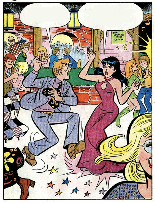
One thing that leaps out at me now as I look at comics is just much they lack standardization. When I mentally picture an Archie comic of the 1960s, for instance, I think of a three tiered page - but I know that there are so many pages that stray from that patterning. I think that by paying strict attention to the geography of the page as it changes over time or even within individual works we are going to learn a great deal. 


Is The Spirit a comic book?

Previously we indicated that “we are proposing to study a randomly generated sample of American comic books produced between 1934 and 2014”. Already you can probably see that this has a number of problems. The first, of course, is the sheer scope of production. We have talked about trying to sample two per cent of these comics; that would be a dataset of more than 5,000 comics. That would allow us to do a lot of interesting analyses, but the sheer scope may be too vast to take on.

This afternoon I began the process of experimenting with the numbers, trying to gauge the scope of comics production over those eight decades. The preliminary numbers are fascinating in themselves, and I look forward to having something concrete to share once we’ve made certain that our data is reliable. 

As I ran some trials today, one thing that kept coming up was our need to define the term “comic books”. I ran a number of trials today on 1948 because it is a year that I’ve previously researched for a different project and I have a reasonably good sense of what was being published that year. The preliminary number that I came up with was 1,858 comic books published that year (a large leap from 1947, but only about two-thirds of the early peak year of 1952). If we sample two per cent of 1948’s production we would have to study thirty-seven issues. When I ran a first attempt at randomizing that year something immediately leapt out at me: I got three issues of The Spirit.

The Spirit, of course, was a weekly publication in an era where everything else was monthly (or less frequent than that). There were fifty-two issues of The Spirit in 1948, so it should show up more than, say, Action Comics. Indeed, The Spirit represents three per cent of all the comic books published in 1948. But only if The Spirit is a comic book.

That’s the core question: is a sixteen-page insert into twenty Sunday newspapers a comic book? If it isn’t sold in the same channels as the other comic books, is it still a comic book? If it is released weekly at a time that no other comic books are produced that frequently is it still a comic book? Or is it something else? A comic book/comic strip hybrid? This is a question to be resolved before we begin. 

If we include The Spirit it will show up frequently because there are so many of them, and they will slightly skew our numbers (sixteen pages rather than the more typical page lengths of the era). If we exclude The Spirit we need to do so before we start, and recalculate our sample size by subtracting all those issues from the initial data pool.

You can also see how this goes: Do we exclude magazine-sized comics (Mad, Creepy, Eerie) or are those also comic books?

Decisions will have to be made. I’d be interested to hear your thoughts especially on whether The Spirit belongs in a study of comic books.

Just what is it that we're doing here?

If you take a look at the “About” tab on our site you can find the single page summary of the SSHRC grant proposal that is the primary driver of this research project. That’s all well and good, but what are we doing really?

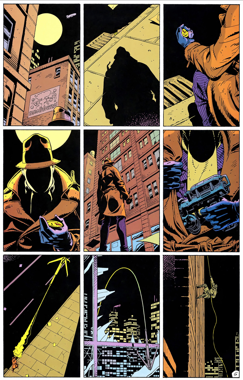
To help explain this project to the 136 students in my ENGL 388 (Comics and Graphic Novels) class the other day I drew on a pair of examples from two of the books that we have read over the course of this term. The first of these was Watchmen. We all know, for example, that the structural basis of Watchmen is the nine-panel grid (three tiers of three panels) that regularizes the layout of the entire work. Here’s an example of that layout from the first issue. 

But let’s recall that Watchmen only seems to rely on a nine-panel grid. The first page, for example, has seven panels, while the second has eight. Indeed, the first nine-panel page doesn’t appear until page five (above). In the first issue, only nine of the twenty-six pages has nine panels. None has more than nine, but the vast majority - almost two out of three - contain fewer. While it is true that you can distinguish the alignment of the grid even in pages that don’t use it due to the choices that Dave Gibbons makes about panel width and height, Watchmen is predominantly not a comic featuring a nine-panel grid, although it is frequently discussed as if it were. Our impression may be that Watchmen is mostly nine panels, but the data shows that only 133 of the 336 pages of Watchmen have nine-panels (39.5%). This project is a first step in discussing these kinds of comic book stylistics through the use of a large data set.

With this project, we are proposing to study a randomly generated sample of American comic books produced between 1934 and 2014. Specifically, we will study a statistically significant sample from each of those eighty years. In the first phase, we will code a series of relevant pieces of data (number of pages per issues; numbers of stories per issue; numbers of panels per page; number of word balloons per panel; number of words per balloon). During the second phase we will be looking at data that is more subjective and more difficult to quantify (for instance, typologies of panel transitions). In the final phase, we will draw upon the data set to author a study of the evolution of comic book styles over time. 

Let’s return, for example, to the Watchmen example. If we note that throughout the series the nine-panel grid typically runs about 40% of all pages, what can we make of this chart?:

That enormous spike in issue six (“The Abyss Gazes Also”) immediately leaps out at us. This is the chapter in which Dr. Malcolm Long examines Rorshach and we learn the back story of the book’s protagonist. Indeed, the preceding chapter (“Fearful Symmetry”, the most formally inventive chapter in the book) is also primarily, though not exclusively, about Rorschach. The seventh chapter (“A Brother to Dragons”, which is the first to have pages with more than nine panels (during the sex scenes)) primarily focusses on Dan and Laurie. Certainly, then, an interpretation that suggests a connection between the non-powered heroes of the book and the nine-panel grid becomes an enticing route for thematic investigation. This would be supported by the fact that the alien-infected final chapter has the lowest number of nine-panel grids (only four out of the thirty-two pages), and is the only chapter that uses traditional single panel splash pages. 

Watchmen provides a very obvious example of how a study like this might work because it is so formally structured. What we are not particularly interested in, however, is analyzing individual works like Watchmen but charting the evolution of the comic book format over time. We are interested in the typical comic books of various periods, not the ones that have been proclaimed the best. Indeed, it is more likely than not that Watchmen would not even be randomly selected into our sample set! Examining changes to comics over time is one of the things we are most interested in.

Take, for example, Saga. I taught my students this book shortly after teaching Watchmen. One of the things that my students immediately noted is that the first issue contains six splash pages, and that the splash in general is one of the visual hallmarks of the work. Moreover, they noted how much more quickly it reads than does Watchmen because the volume of text is quite reduced. I think it is a commonplace to note that contemporary superhero comics contain less text than do comics from thirty years ago, and that those contain less text than comics from thirty years prior to that. Yet we lack the tools to actually demonstrate this assumption that is so routinely taken for granted. 

ri6blyr3267ctqzgvdje.png

Moreover, we throw a spanner into the works when we talk only about superhero comics, or, worse, only certain types of superhero comics (that is, comics from “the big two”). Watchmen is often praised as realist because it lacks thought balloons and sound effects, and it is noted that in the wake of Watchmen many comic book artists abandoned these story-telling elements. Can we actually demonstrate that with data? Moreover, when we step further back we might note that most Archie comic books of the 1960s contained no thought balloons or sound effects. Is Watchmen radical for borrowing the formal stylistics of Archie?

This is very much only the tip of the iceberg, but, I hope, it gives a small sense of our goals. In the coming weeks I hope to blog a bit about the theory behind what we are doing, and then, once term ends, we will begin working on our data set and coding protocols in earnest. We will be sharing our thoughts on these topics as we go, and we really hope to encourage feedback wherever possible : better to identify a misdirection early in the process than to have to go back and begin again.

-BB